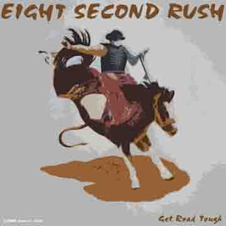
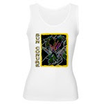
I made these two designs using both PhotoShop and Illustrator graphics programs. In Photoshop, I had to change the resolution and size of the images. They had to end up at 2000 pixels per inch with a resolution of 200 dpi and be 10x10 inches, to fit the template and to get the best image results. The Sun Conures took a bit more work to complete than the Bucking Bronc.
First I had to open the image in Photoshop, and go to Images>Image Size and have both the 'Constrain Proportion' and 'Resample Image' boxes checked. I then chaged the Resolution to 200, and the Height under Document Size to 10. It's a rectangular image and I need a square, so I had a lot more work to do. I saved the image as a JPG file, and gave it 0 compression.
I then opened Illustrator, opened a new 10x10 inch document, and placed my now HUGE image into this document. I then played around with the filters until I found a result I liked, under Filter>Stylize>Glowing Edges. This made bright, stylized outlines of my drawing, and turned all of the spaces black. Very Cool! But I still had several inches of white space to fill, and I didn't like the plain black box of the image.
I took the pen tool, and drew a border around the image. I then selected this border, and grabbed a wicked looking default brush, set the stroke at 5 and chaned the color to a bright yellow. The effect was awesome! I had to do a bit of 'tweaking' around the edges, where the black box and the frame met, and that was a bit time consuming.
I selected everything and moved it to the right edge of the document. I then took the text tool, and opened a horizontal text box on the left edge. I hit Caps Lock and typed the words SUN CONURE down the side of the image. I messed with the horizontal and vertical of the text, the leading and the font and size. I liked what I ended up with, but decided to change the color to the same yellow as the frame, and outline the text in black. But I wasn't done yet...
I rasterized the document, flattened it, and changed the text to outlines. I then saved it as an Illustrator file and re-opened it in Photoshop. Here I did a bit of tweeking on the size again, making sure that it was 10x10 inches, 2000x2000 pixels and 200 resolution. I flattened it and saved it as a .JPG file with a compression of 0.
This whole operation took me about 5 hours...but it was well worth it.
The Bucking Bronc was much easier to complete. I did the same first steps with the image size as I did with the birds, but instead of the extra work in Illustrator, I simply took an artistic filter that I liked and applied it to the image. Since I still had plenty of white space around the edges of this, I did the old 'copy and paste' method of filling in the white with the background that I needed. I flattened the image, added the text, rasterized that text, and flattened it again. I saved it as a .JPG just as I did the Sun Conures and was all done. It took less than 2 hours to complete.
Here are the Sun Conures.
And here is the Bucking Bronc.

I have these on several shirts in my cafepress shop. Here is a Women's Tank Top with the Sun Conure design.

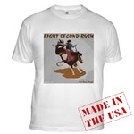
And here is a Fitted T-Shirt with the rodeo design.

Tell me what you think of them!
No comments:
Post a Comment